
Graphic Standards Guide
Corporate Design and Branding

Overview
Project: Corporate Design and Branding class
Project type: Graphic Design
Timeline: Sep-Dec 2020
Designs: Logo design, business suite design, ephemera, pocket folder, brochures, sales sheet, digital banner ads, mobile app icon
Tools Used: Adobe InDesign, Adobe Photoshop, Adobe Illustrator
NOTE: This is a fictional company and this project was completed as part of my academic study.
Challenge
In order for branding to work, it has to be applied consistently across all of the digital and print assets. It also means that the visuals--color palette, fonts, logos--must be uniform across all platforms, and that the brand’s guidelines, story, and purpose are well understood by all the users.
Solution
The goal was to think about target audience while building a positive perception and a professional image about EVO that triggers specific emotions encouraging potential customers to prefer this business over competitors. Keep it modern and playful for all the target audience.

LEARN
RESEARCH
I started with researching about renewable energy and its types. I checked out competitors and I analyzed EVO’s mission, values and the brand essence. This helped me to understand what the client want to convey by its brand. To learn more about renewal energy and what people think about its marketing materials I talked to few people. I showed them current competitors and I asked them what they think about their work, design and the approach. My goal was to learn what did not work in the current work so I could avoid that in my designs.
OUTLINE/PLAN
This step was important in order to manage my time successfully I had to make a plan and organize my work so I would not miss deadlines. I outlined the steps I wanted to complete each day. I started with creating a logo and the subrands. Later, I worked on color pallet and the design solutions.
BRAINSTORM IDEAS
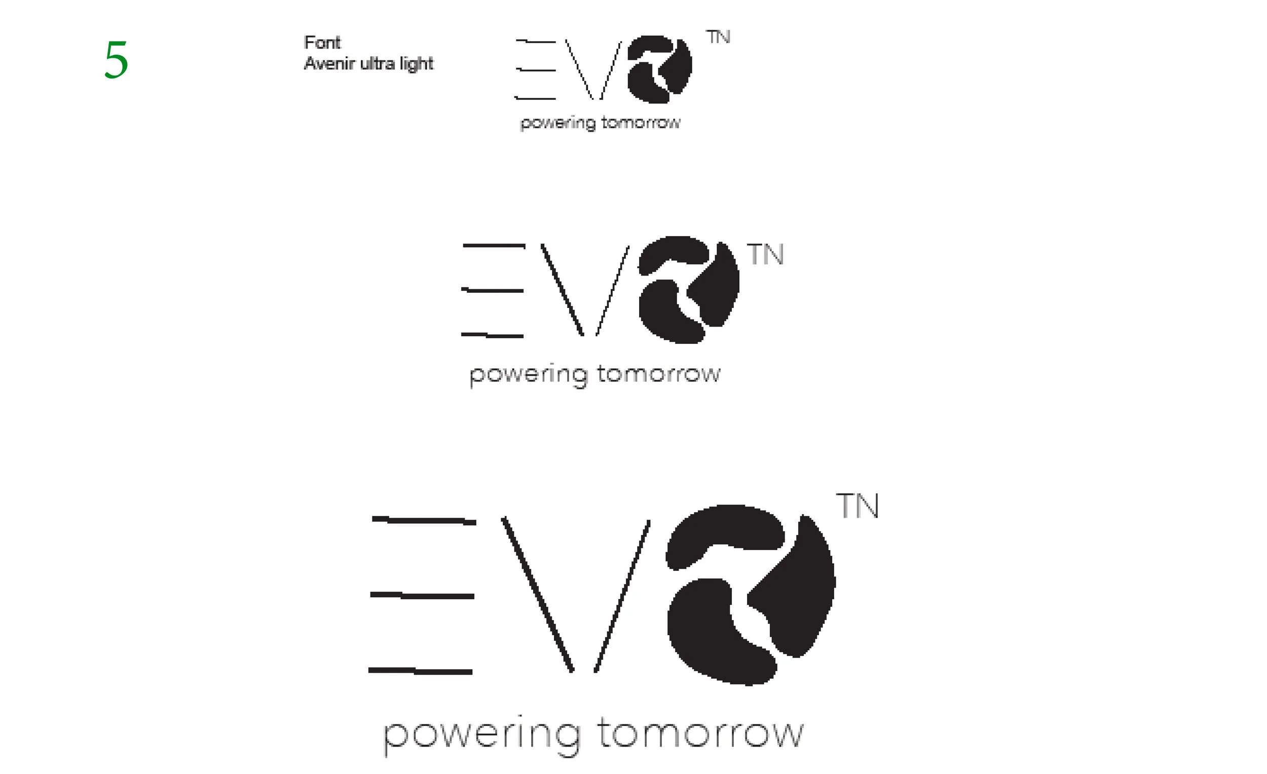
Creating logo can be a time consuming process, therefore, I decided to start my project with logo. I brainstormed by sketching ideas and after having hundreds of sketches I narrowed down to four I thought would work for my brand. Before, I did it I asked for feedback my classmates and my professor. This step was cruitial to learn what they think about the ideas in order to learn if they would work for my brand. After getting the feedback and discussing what I want my brand to convey I decided to go with the logo number four (leaf on the top as a part of a letter “v”). I went with this design because of the simplicity and clean look.


DESIGN
CREATE
This was a stage in my design process where I started to introduce color to my brand. I created moodboard to see what the finished product will look like and show what direction I wanted to go with my brand. I designed logo with subrands and this step helped me to work on other elements because at this point I knew what color pallet I wanted to use. The logo was designed approaching minimal design, where “less is more”. I focused on green color because it represents growth and renewal, being the color of rebirth. My brand is all about creating more sustainable planet. This visual style includes one basic shape, which is the leaf representing the green energy. I wanted my brand to be modern, simplistic and legible. After that I designed business suite design, pocket folder, brochures, sales sheet, digital banner ads, mobile app icon.

At this point I had fundamentals done so I created business suite (business card, letterhead and the envelope) and the digital marketing elements was the next step. I wanted the color pallets to coordinate with the logo and sub brand colors.
Click to enlarge
Designing an app icon my main goal was to keep it simple and readable. The digital ads are simplistic and straight to the point as well. I’m using bold and capital letters to be visible in every screen size.

Click to enlarge
Click to enlarge
ITERATE
PRESENT
At this stage of my design process I was ready to present my final designs. I created emphera where I mocked up my work to show how would it present on real products. By looking at the products I want the brand identity to be simple, but never boring; flexible, but never chaotic; playful and iterative — and always supremely recognizable. Therefore, the design is minimalistic.
Click to enlarge
REVISE AND FINALIZE
After presenting my work and getting feedback I did small tweaks here and there but for most of the design part I received a positive feedback. The logo was a successful design that developed brand’s message and I was able to successfully tied the logo to a various of products that can promote EVO.
Click to enlarge
Click to enlarge
LAUNCH
SUBMIT FINAL ASSET
The final EVO standard guide was created in Adobe InDesign where I put everything I designed in one place explaining EVO’s values and brand message. You can find the PDF file here.
Click to enlarge