
Safe Date
UX/UI Case Study
Overview
Project: General Assembly 2 Day Product Design Bootcamp
Project type: UX/UI Design
Timeline: 80 hours
My role: User Research, Strategy, Interaction Design, UI Design, Prototyping, Usability Testing
Tools Used: Figma, Balsamiq,
Adobe Illustrator
Challenge
Wine tasting. Discussing books. Going to concerts. These all sound like fun activities for a date night in a pre-pandemic world, before we all started self-isolating, wearing masks, and sheltering at home. Social interaction looks different right now. How can we help people be safe while going out on dates during a pandemic?
Solution
Safe Date is an app that helps users find ideas for a date during a pandemic. I believe that by creating a platform for people to socialize in a safe and interesting ways, it will help people form genuine and more meaningful connections.
DESIGN PROCESS

EMPATHY
I began the process with research goals to discover how people approach searching for a perfect date and to understand what influences their decision on whether or not go on a date especially during a pandemic. I also sought to identify and analyze Safe Date competitors in order to gain a better understanding date app industry, and uncover gaps among the existing apps.
RESEARCH COMPONENTS
Market research
Competitor analysis
User surveys
User interviews
RESEARCH PLAN
The Research Plan was created in order to help define the target market and to discover their behaviors and views towards dating.
SECONDARY RESEARCH
First, I conducted secondary research to gain a better understanding of date apps, the target market, existing apps and the market space.
Click to enlarge
MARKET RESEARCH
I began my research by delving into learning about and understanding the current date app market and Safe Date’s target audience. Finding safe places for a date during COVID-19 and just coming out with ideas can be challenging.
There are fewer places to meet new people
Both in-person or through video chat, increased by 17% from August 2019 to August 2020 according to Hinge data.
It’s harder for couples to have new experiences together or get physically intimate, which makes it harder to bond.
“Messaging on Hinge increased 30%. Tinder saw its biggest day ever on March 29, with over 3 billion swipes, and on OKCupid, virtual dates shot up 700%, according to Business Insider”.
Once a couple has had a series of successful virtual dates, where do they go from there? And how do they do it safely?
After market research, I looked into Safe Date’s competitors and browsed through threads written by avid readers and users of similar apps on places like Apple's App Store and Reddit. For qualitative data, I searched for social media, Reddit, and other places where the target audience would share their reviews and thoughts on book tracking apps.
COMPETITIVE ANALYSIS
Afterwards, I conducted a competitive analysis of iOS apps that shared the similar target audiences and provided similar services as Safe Date. I relied heavily on App Store reviews to gauge the strengths and weaknesses of each competitor. I primarily used SensorTower and Apple's App Store to read customer reviews of the competition. Based on my findings, I was also able to confirm that Yelp was the top competitor. I was also able to identify other competitors and related apps. I then looked into assessing each competitor based on the customer reviews and downloaded each of them on my phone to get a firsthand glance.
Click to enlarge
The strengths identified across the various platforms included:
Search features
Ratings and reviews
Simple to use
Opportunities discovered based on my competitor analysis:
Improve the UI
Faster integration and identification of COVID safe places to go
Smooth integration for log in and social media connection
PRIMARY RESEARCH
To better understand the pain points and goals of those who use dating apps and other parts of my research questions that the secondary research was unable to answer, I developed an interview script and conducted user interviews with participants over the zoom. I interviewed three people during my bootcamp and one person after the course.
“I would love to know an app that tells you if the restaurant has heaters outdoors. Restaurants should have universal standard COVID code so you know if it’s safe and socially distanced. I always look at pictures and reviews.” -Kate

QUALITATIVE TAKEAWAYS FROM INTERVIEWS
Safety is users top priority
Creativity of date nights has increased since COVID-19l began in 2020
Different approach to dating since COVID-19 has started
Limiting in-person interactions is causing loneliness
Curation / logistics are a barrier to covid socializing
Couples in relationship also desire ideas for COVID safe and fun dates
Users are getting tired of being in front of screens all day
Difficult to make a genuine connection remotely
Lack of incentives to follow through for future dates
People need a way to socialize without the fear of catching COVID
DEFINE
EMPATHY AND PERSONA DEVELOPMENT
After going through my interview transcripts and identifying behavior and need patterns, research was synthesized into a set of deliverables that guide me in keeping the users as a priority in the design process.
In order to understand my key users better, I created two personas and an empathy map.
I created the personas, John and Claudia, using my research, namely that from the 1:1 interviews.
To further explore relationships and develop the persona that emerged from the data I’d gathered and mapped, I created an empathy map made up of observations and statements from my user interviews and diving deeper into John’s mindset. This helped me further understand the emotional state of the user.
Click to enlarge
Click to enlarge
Click to enlarge
POINT OF VIEW STATEMENTS AND HOW MIGHT WE QUESTIONS
Now that I had a better understanding of my users and really honed in on the specific pain points, it was time to focus on creating solutions. From my insights and needs, I rephrased these into a point of view (POV) statement and reframed each these as a “how might we?” (HMW) question, in order to start working towards solution-focused designs.
How might we provide users a quick way to search COVID safe activities?
How might we help users receive COVID safe dates recommendations?
How might we provide users a quick way to save their COVID safe list of places?
I then used these HMW questions to begin brainstorming solutions. I did this by writing down each of the HMW questions, spending 2 minutes writing solutions for each, coming up with a feature roadmap and landed on several features that would solve the narration and concentration challenges:
Click to enlarge
IDEATE
APP MAP
I developed app map to solidify the organization of screens within the app.
Click to enlarge
USER FLOW
Using the sitemap, research findings and developed persona, I was then able to chart a user flow. The flow below shows several main paths for a user.
Click to enlarge
WIREFRAMES
I began to wireframe key pages informed by my task flows. I took to pen and paper to start with hand sketching. In these initial sketches, I was able to quickly brainstorm and come up with alternate ideas, building on each of them in order to move on to mid-fidelity sketching.
The first three screens are versions for home page, the next pages are profile versions, search and date details page.

Home page Version 1

Home page Version 2

Home page Version 3

User's profile version 1

User's profile version 2

Search a date page

Results page

Date description version 1

Date description version 2
I then moved to Figma to create mid-fidelity wireframe key pages. I created a mid-fidelity desktop prototype of the main user flow using Figma. This enabled me to visualize the early designs more concretely, see how the interactions flowed, and to be able to have users test it out.
Click to enlarge
After receiving feedback and implementing some changes to the wireframes, I moved on to the visual design phase. Some users mentioned that they would like to have a notification screen, which I was able to quickly add. Also, users mentioned that My Dates screen is too busy and they would like to see less content.
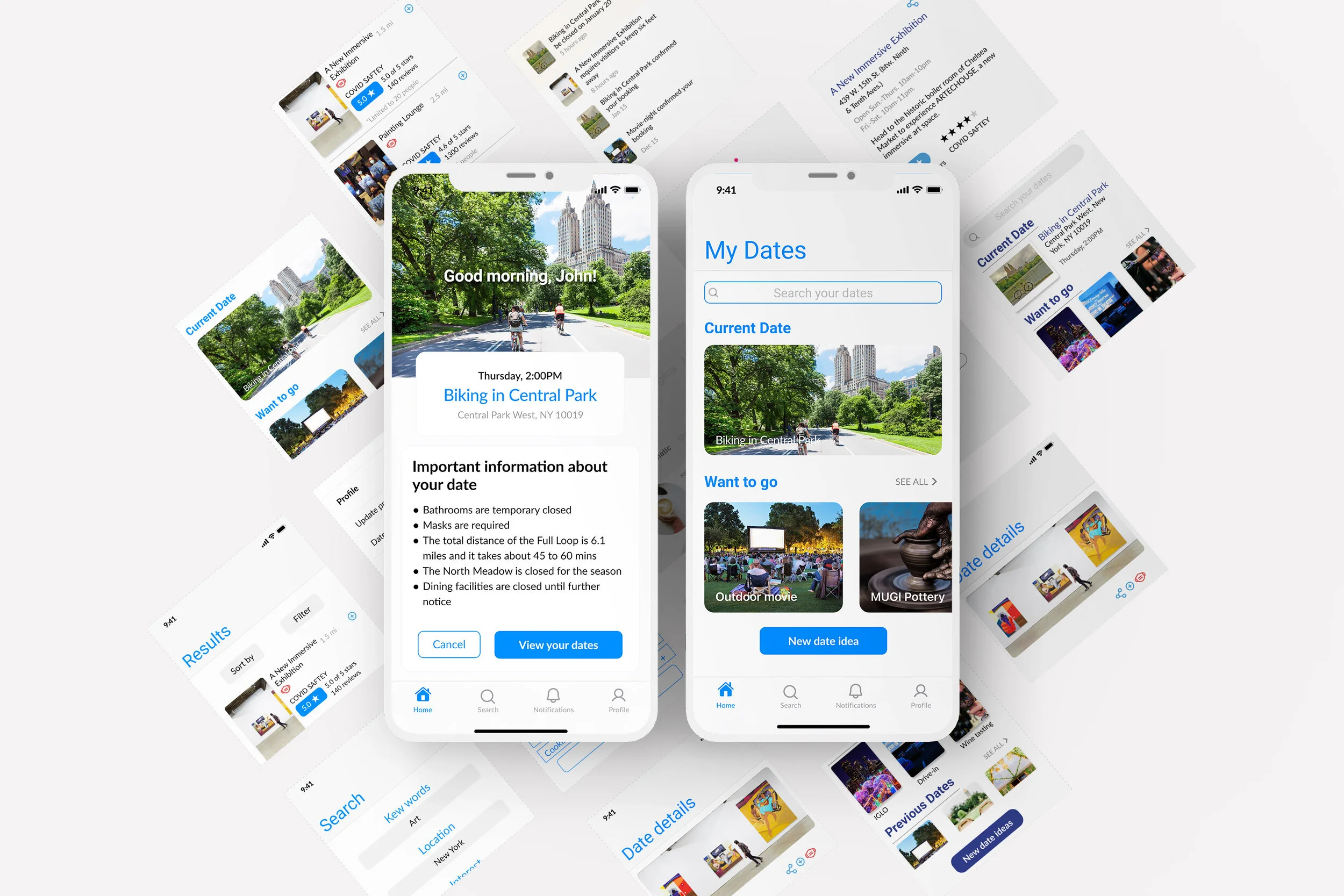
PROTOTYPE
MOCKUPS
I decided to use blue as my main color because blue gives a feeling of trust. It stands for communication and efficiency and that is what I want this app to deliver. It helps users to find safe dates during COVID-19 times. The user will trust the app to choose a great location for a perfect and safe date.
Click to enlarge
TEST
USABILITY TESTING (Overview & goals)
I tested the usability of the main user flow using the high-fidelity prototype. My main goals were to:
Evaluate the overall usability of the app.
Make note of any difficulties for further iteration/improvement
Collect feedback from users on ease of navigating app
To test these designs, I tested the high-fidelity prototype on three users remotely using Figma. This method allowed me to get quick feedback users and some automated analysis of the results.
KEY FINDINGS
All the users sucesfully completed tasks viewing their current date, looking for new date ideas and checking out date details.
REFLECTIONS & LOOKING AHEAD
That was my first time using Figma and I loved it! It’s such a powerful and easy to collaborate tool that I will defiantly start using more often. This project helped me better understand the design process and how each of the steps connect. It was an intense bootcamp through zoom where I learned to communicate with people virtually and exchange ideas. For the future of this project, I would love to include a on-boarding process for users to understand my apps features. Also, I would work on creating a logo.